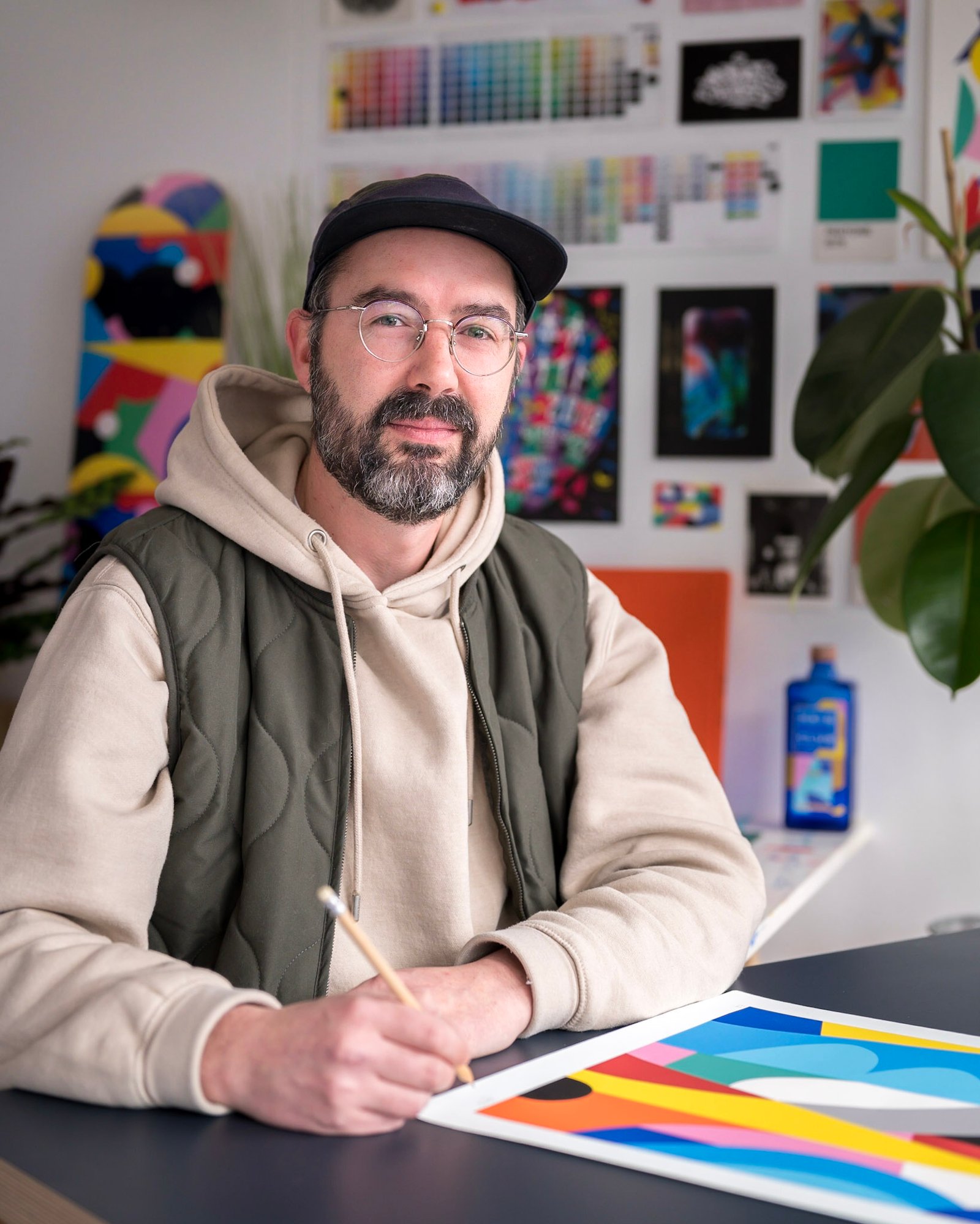
Discovering Simon Poter’s universe is a real delight because, while the artist inscribes his work within the movement of geometric abstraction, the formal rigour is dispelled by a striking rhythm that leads us into a resolutely vibrant momentum, and we feel intensely the full dimension of pleasure emanating from the artist’s approach.
Poter, a pictorial research nourished by graphic design and graffiti.
Simon Tissier aka Poter lives and works in Lyon, where he works in urban space and in a studio. Passionate about graffiti since his adolescence, he has developed his lettering and visual signature in abandoned spaces. A practice motivated by aesthetic exploration rather than rebellion: a search for supports and artistic playgrounds. Simon Poter is now very present on the Lyon urban scene, in full expansion and proving to be particularly stimulating.
His active life has focused on graphic design, having studied applied arts and then at the Beaux-Arts in Lyon. After gaining experience in advertising agencies, Simon Poter established himself as a creative graphic designer, while his mural practice evolved towards post-graffiti. These two parallel aspects of his work then became more explicitly intertwined in a pictorial research that unfolds a geometric abstraction of simple forms that is tensioned kinetically by contrasting stark colors: dynamic compositions that characterize an acid pop visual identity. This striking plastic signature is now instantly recognizable and has earned him numerous requests for in-situ interventions in public spaces, either individually or in conjunction with street art festivals. He has notably participated in editions of Peinture Fraîche Festival, Le Mur, Mécaniques Urbaines, and many other events. He has carried out numerous public and associative projects to enhance public space, offering everyone accessible art that enchants the places we pass through every day.

Abstract City, 2023
Acrylic on linen canvas
Unique work, signed
H80 x L120 cm
A mural creation Poter x Quai 36.
Simon Poter had the opportunity to collaborate with the art production house Quai 36 as part of the architectural project Entract’ for the construction of the ArtChipel residence in Garenne-Colombes in 2020, proposing a monumental fresco designed as a vibrant graphic rhythm of color pulses, where the forms would have replaced the notes. One cannot help but draw a parallel with Pietr Mondrian’s passion for jazz and boogie woogie, a passion that inspired some of his paintings from the New York period, with constructions of colored lines evolving in dynamic equilibria with the discovery of free rhythms. Mondrian indeed conceived jazz as a musical equivalent of pictorial neoplasticism. The abstract pattern project by Simon Poter x Quai 36 is rooted in this rhythmic proximity. The mural accompanied the construction period until the end of 2021. The all-encompassing format immediately inspired the artist, who deployed his fresco in the manner of a musical score, between the linearity of repetitions and improvised breaks, in colorful sequences that are particularly captivating for the eyes of the residents and passersby. Quai 36 represented an essential reference in urban art production for Simon Poter, who was very enthusiastic about this immersive experience with the teams. A friendship was formed and he is delighted to be returning to Quai 36 this spring 2023 in partnership with the Hatchikian gallery for the show duo Jumpin’Colors.
Enthusiastic collaborations with iconic brands and labels.
Alongside monumental in-situ projects, his career as a creative graphic designer has led him to collaborate with several iconic brands, which have approached him with a clear brief but with respect for his visual uniqueness. Simon Poter chooses his partnerships based on his desires and challenges, as the dimension of pleasure is evident: from sports labels to streetwear and lifestyle brands, and more recently, a renewed collaboration for collector designs on the bottles of the Scottish whisky brand Haig Club, of which David Beckham is one of the founders. The drink should be consumed in moderation, but the colorful graphics are to be enjoyed without restrictions! Simon Poter has also designed a playground at the Tony Parker Academy of Basketball in Lyon.

The transition to working on canvas: from the bombe to acrylic paint.
Inspired by his graphic experiments, which have been developed through various projects for communities or brands, Simon Poter has shifted his work towards the canvas, establishing himself as a fully-fledged artist. His small-format compositions for gallery displays take up his geometric style of bold shapes and colors, sometimes with a nod to the origin of his graffiti career: the Poter lettering can appear more or less explicitly in his assemblages, however, evolving towards a more refined typography. However, the need to add this calligraphic signature has faded as his artistic identity and recognition have been affirmed by the uniqueness of an arithmetic play with shapes and colors. Today, it is the studio work that takes a prominent place in the artist’s path. The transition from the bomb to acrylic for small formats offers the possibility to create one’s own colors, although Poter always works with a limited palette, with a predilection for yellows that appear almost systematically in his planes, roses, turquoise and blues. The paintbrush brings a subtlety and precision that the bomb does not allow to be achieved. The work in the studio thus requires the need to push the aesthetic proposition further. Poter works from maquettes that he creates in order to visualize in advance the final result of the work, the effects of rhythms, patterns and color associations. In general, the artist needs to give himself a structure, a framework to initiate a creation. The sketch is an essential step in the research process. Over time, he tries more and more often to use hand-held techniques to open up a part of improvisation and spontaneity in the creative act. A way of combining rigor and abandon to play out one’s own plastic score.

White Variation, 2023
Acrylic on canvas
Unique work, signed
H150 x L120 cm
Poter's works are in the tradition of geometric abstraction and concrete art.
Poter’s works are eminently contemporary, in keeping with the codes of their time, boasting a resolutely pop spirit; yet they can be placed within a more timeless movement that has spanned decades since the 1920s. His language of abstraction finds its origins in movements that share a common tendency to translate purely plastic questions into explorations of the relationships between line and color, creating tensions between forms, axes, and geometries, and effects of repetition of motifs: a formalist art of fragmenting planes that showcases the dynamic power of color. The Bauhaus and Kandinsky, through their aesthetic of pure forms, fluid designs, and bold colors, remain sources of inspiration for Simon Poter. His geometric abstraction places him within the lineage of concrete art with its De Stijl influences, which claims this clear and rational universality. The rhythmic punctuations of lines and colors orient the gaze towards the materiality and objectivity of a pictorial approach stripped of any introspective subjectivity as well as of the metaphorical or conceptual dimension. Concrete art claims a form of radicality of abstraction, which is no longer referred to a reality but constitutes a common, autonomous and self-referential language. Painting is conceived as pure creation, an arithmetic composition. In the 1930s, the manifesto of concrete art stipulates that the works must be entirely elaborated by the mind before execution, outside of external symbolic data. The pictorial element, in this arrangement of forms in planes, thus has no other meaning than itself. Some of Simon Poter’s compositions could also be compared to the characteristic vibrations of op art, coming from the movement by means of rhythm and illusion effects. Vasarely is among the artist’s references who, in retrospect, sees the similarities between his works and the pieces he discovers during his museum visits. Sometimes it is the viewers who suggest such connections: he remembers a visitor who pointed out an obvious affinity between his work and Serge Poliakoff’s, for example.

The exhibition Jumpin’Colors, a colorful and friendly graphic battle with David Bruce.
Simon Poter is delighted to confront his work amicably with that of David Bruce at the Jumpin’Colors duo show presented by Hatchikian Gallery at Quai 36. Symbolically, this Parisian exhibition, held in the year of its 40th anniversary, marks a form of review of his creative journey and his pictorial evolution. The works produced for this event will offer a panorama of his emblematic work but also open up some new paths around new elements and original textures to create variations in rhythm. Some canvases will display monochromes in a gradient, including a monochrome in a gradient of white – an atypical color variation for the artist – still with geometric shapes, which do not fail to resonate with contemporary works by Klee. The artist also plans to explore the figurative with a canvas depicting a multicolored «Poter City» stylized with architectural features and elements of urban life – a city in which one would like to live. He will also present two handmade carpets that take his patterns in the manner of a print, where one will find his signature of shapes and colors: an exuberant intensity of abstract patterns. Poter is indeed very attracted to prints and his approach can very well be extended to the field of interior design and decoration. Furthermore, the work on small formats in the studio has already been an opportunity for him to experiment with the technique of paper collage with overlapping effects, which is clearly in line with his way of composing.

Simon Poter joins Hatchikian Gallery for the duo show Jumpin’Colors.
On the occasion of the exhibition Jumpin’Colors, which will present her work in a duo show with David Bruce for a joyful revival of color this spring 2023, Simon Poter joins the artists of the Hatchikian gallery with vibrant compositions that hypnotize our eyes and take us to another dimension where the universe reveals itself bursting with pigments.